brooklyn.shakib6472.com

GA Archery Mobile App

Home
Work
Golden Arrow Mobile App

Project Overview

The Golden Arrow Mobile App was designed to improve the experience for students, parents and coaches by bringing attendance, progress tracking, achievements and communication into one intuitive platform. The project followed a user-centred design process, beginning with research and user journey mapping before progressing through wireframes, prototypes and high-fidelity UI design.

My Role

UX Research
User Journey Mapping
Wireframing
UI Design
Interactive Prototyping
Usability Testing

Project

Client
Golden Arrow Archery
Project Type
UX/UI Mobile App Concept
Platform
iOS Mobile Application

Timeline

2026
6 Week Design Sprint
Tools
Figma

Home
Work
Golden Arrow Mobile App

The Challenge

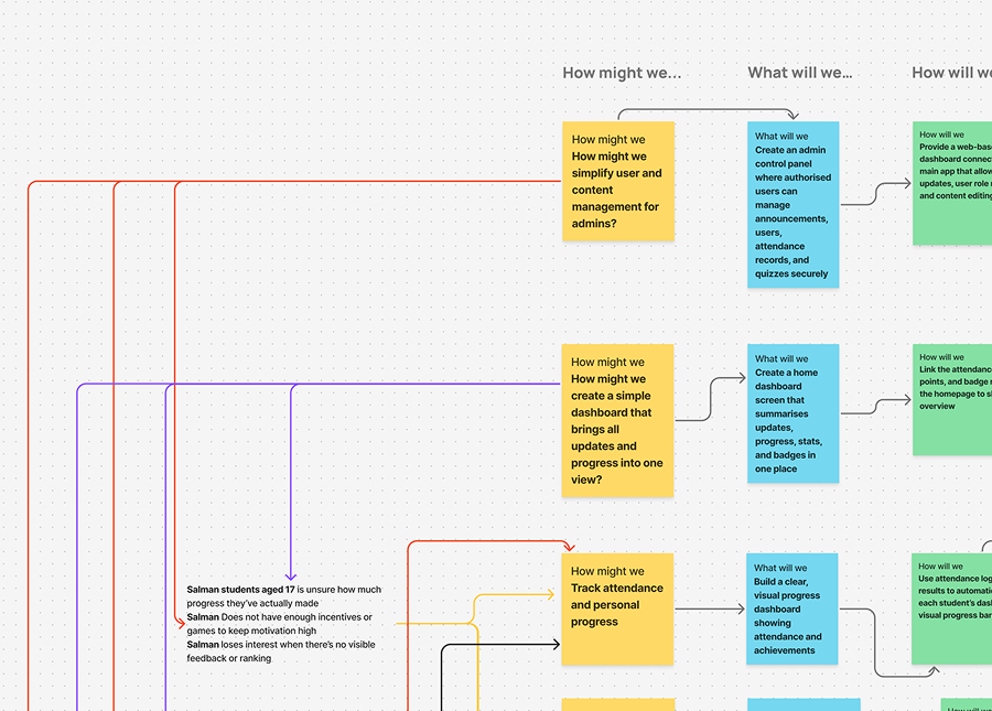
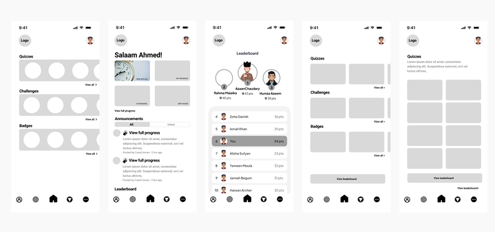
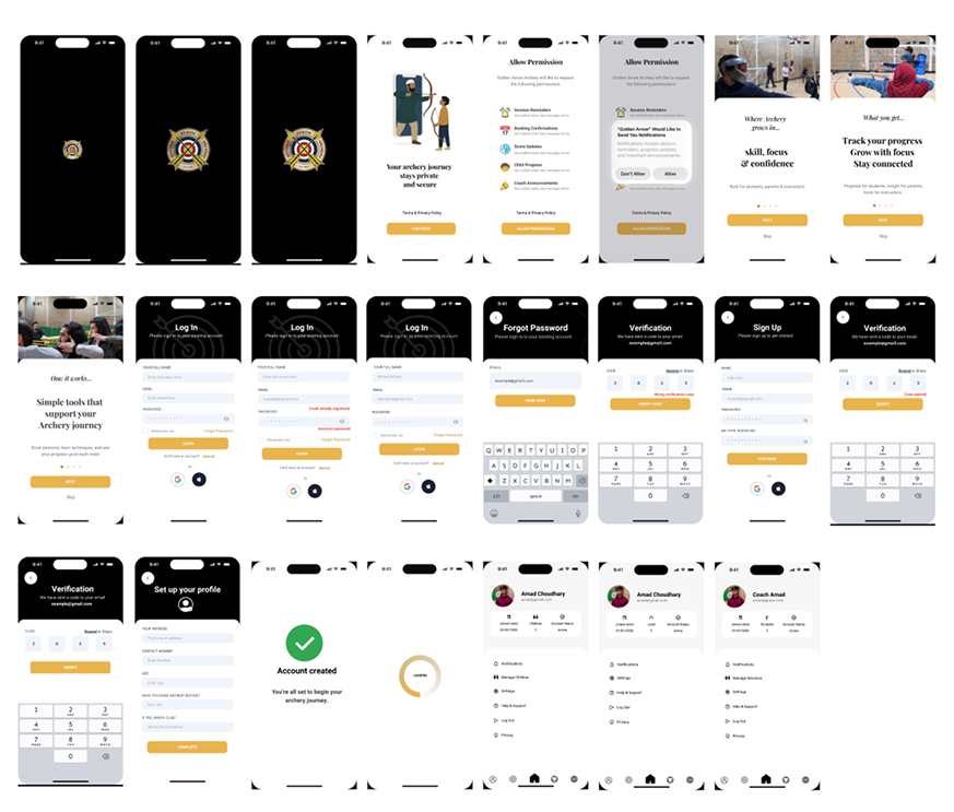
Golden Arrow Archery relied on manual processes for attendance, communication and progress tracking. Parents had limited visibility of their child’s development, coaches spent unnecessary time on administration, and students lacked a central place to track achievements and stay motivated.
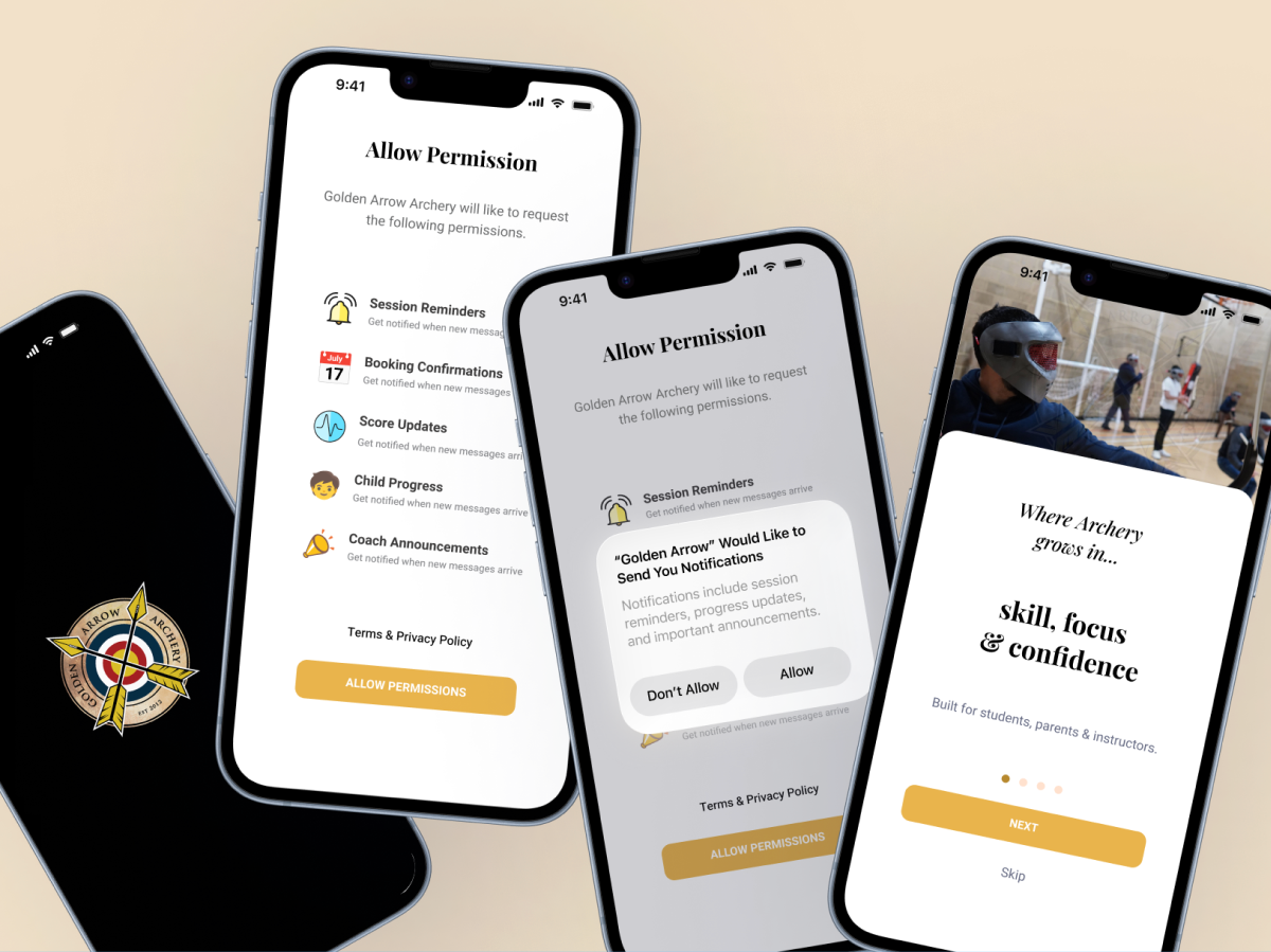
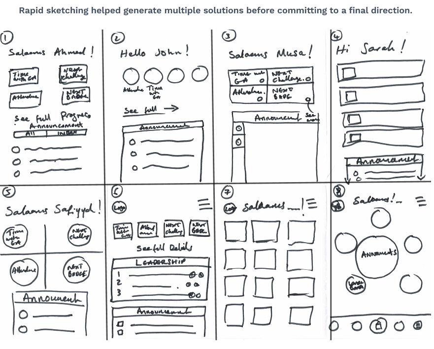
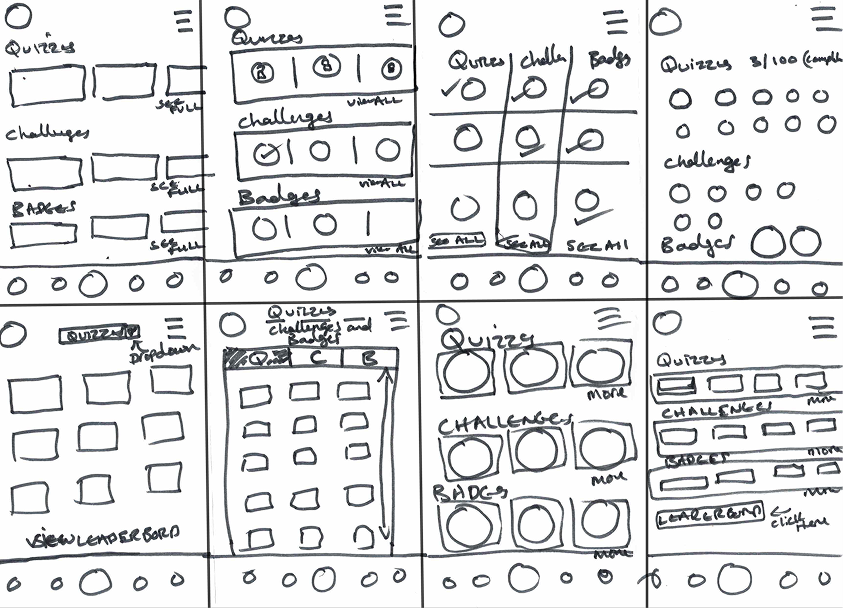
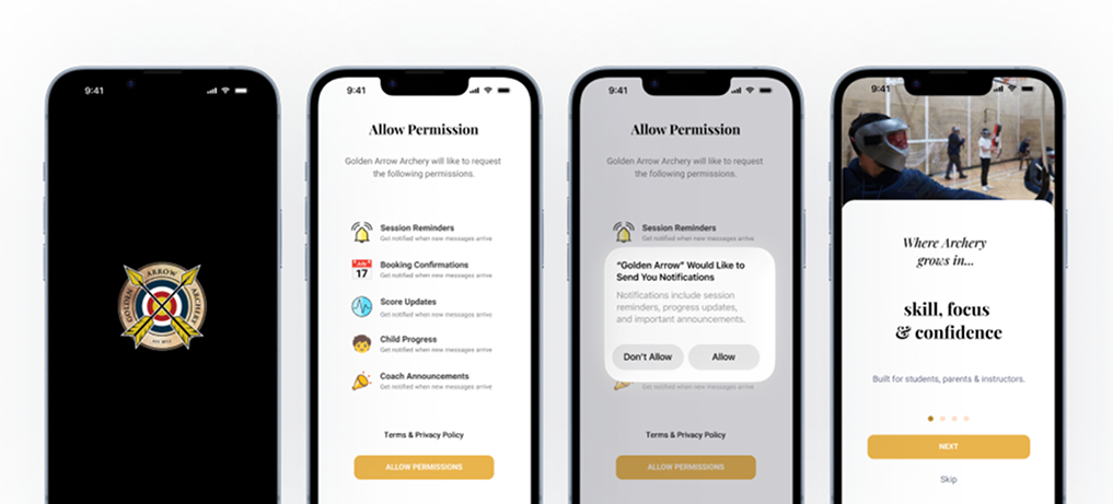
The aim was to design a simple, intuitive mobile app that streamlined administration, improved communication and created a more engaging experience for members, parents and coaches.

Research Findings

To better understand the needs of the Golden Arrow community, I gathered insights through discussions with parents, coaches and students, alongside observations of the club’s existing workflow. These findings highlighted recurring pain points and helped shape the direction of the design.
The following themes emerged during the discovery phase.
Parents

Limited visibility of their child’s attendance and progress.

No central place for announcements, achievements or updates.

Communication relied on multiple WhatsApp groups.

Coaches

Attendance was recorded manually.

Progress tracking and administration were time-consuming.

Managing multiple groups was difficult.

Students

No clear way to track achievements or personal progress.

Limited motivation outside of weekly sessions.

Lacked rewards and motivation to stay engaged.

Define & Ideate

After identifying the key challenges, I translated the research into clear design opportunities using the How Might We framework. This helped reframe user problems into actionable design goals and guided the brainstorming process for the overall app experience.
I explored multiple ideas, prioritised the features that would deliver the greatest value to parents, coaches and students, and defined the core functionality for the first version of the application.

Turning Insights into Opportunities

Using the “How Might We” framework to convert research findings into product ideas.

Key Design Opportunities

Sketching & Ideation

Once the key opportunities had been identified, I explored multiple interface ideas using the Crazy 8s ideation technique. This rapid sketching exercise helped generate a range of possible layouts before refining the strongest concepts into digital wireframes.

The strongest concepts were developed into digital wireframes, refining navigation, information hierarchy and core user journeys.

High-Fidelity Designs

The selected concepts were refined into high-fidelity mobile interfaces, focusing on clarity, usability and visual consistency. These designs showcase the core user journeys, including onboarding, authentication and personalised experiences for students, parents and coaches.

Splash Screens • Onboarding • Authentication • User Profiles

Outcome

The concept provides a central platform for students, parents and coaches, replacing several manual processes with a more connected digital experience.
Key improvements